It’s always an honour to be selected by someone to help them create a visual identity that reflects their personal style and values – it’s feels even more special when chosen to do this by a fellow designer! Meg is the talented entrepreneur behind her women-led web design studio, creating beautiful, conversion-focused websites / online shops for creative and lifestyle businesses.
With a self-described love for modern, elegant and thoughtful design, it only made sense that Meg’s branding reflected the very same values.
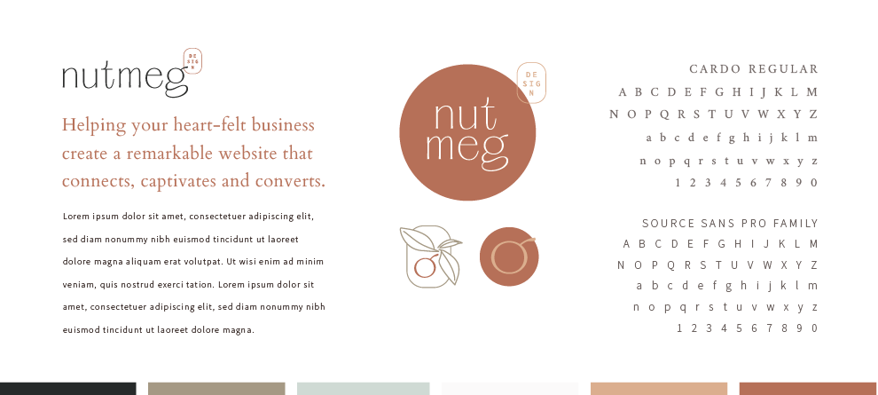
I approached the design with a strong understanding that it needed to showcase Meg’s personality and appeal to her potential clients by showing the same attention to detail, care and thoughtfulness that she puts into each of her own web design projects. The resulting wordmark is simple yet full of character and visual interest, and the accompanying brand symbol – a literal nutmeg nut – thoughtfully incorporates a section of the ‘g’ (from the logo) to create the ‘nut’ combined with hand drawn foliage (the idea of the warm spice itself, also infused in the brand’s autumnal, earthy palette…)